

In today’s fast-moving e-commerce landscape, creating a seamless, enjoyable shopping experience is no longer a nice-to-have… it’s a necessity. Customers expect intuitive navigation, and engaging content that not only helps them find products, but also inspires them to discover more along the way. For brands, this means every design choice and feature has the potential to influence conversion. To help you stay ahead, we’ve rounded up ten of the most exciting trends and practical innovations that enhance usability, reduce friction, and keep customers coming back for more.

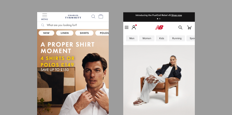
Mobile Navigation Tabs
Mobile navigation is evolving to use highly visible product categories placed directly on the home screen, alongside the traditional hamburger menu. By surfacing key links upfront, brands make it faster and easier for shoppers, especially those landing from social media or casual browsing, to find what they’re looking for without extra clicks. Retailers like New Balance and Charles Tyrwhitt are already adopting this approach, creating a cleaner, more intuitive interface that not only streamlines the shopping journey but also reduces friction and boosts engagement.
Short Form PDP Videos
Introducing video playthroughs to product detail pages gives shoppers a more dynamic and realistic view of items, as opposed to just static images. Videos can highlight scale, texture, and functionality, helping customers better understand how a product looks and works in real life; building trust and encouraging more confident purchases. Features like this make the experience smoother, letting users watch demonstrations while browsing the rest of the details. This not only keeps exploration engaging but also sets clearer expectations, reducing uncertainty.
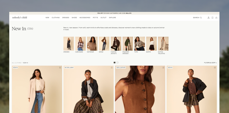
Filter with Product Thumbnails
Adding imagery to category filters on product listing pages makes shopping far more intuitive and engaging than relying on plain text menus. Shoppers can instantly recognise styles, like coats or knitwear, without needing to interpret labels, which speeds up product discovery and reduces friction. Beyond usability, these visuals also spark inspiration, making the experience feel more like browsing a lookbook than scanning a menu. This not only keeps customers engaged longer but also increases the chances they’ll discover products they might not have initially set out to find.
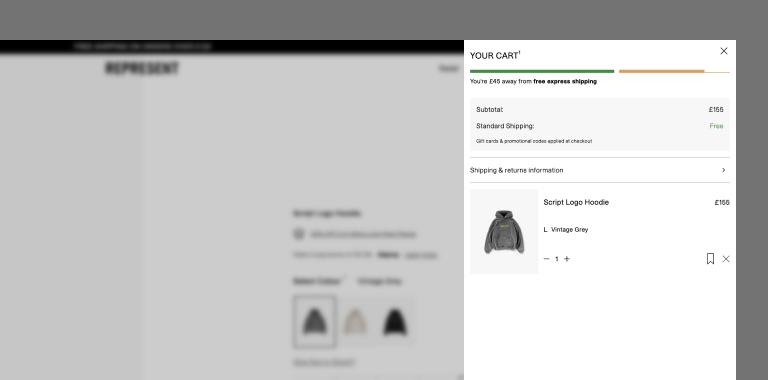
Double Down on Free Shipping
One of the most effective ways to boost average order value (AOV) is through the implementation of tiered shipping thresholds. This is an intuitive way to encourage product discovery and drive customers to include more items in their basket. Represent emphasises this feature through a clean, dynamic progression bar, that clearly showcases each threshold of “free shipping” and "express free shipping”. This transparency gently nudges customers towards further purchases in the same order without creating friction, resulting in a smoother shopping experience that directly lifts AOV and conversions.
Video Reviews & Demonstrations
Authentic video reviews are a powerful way to build trust and boost sales, letting shoppers see products in action while hearing genuine feedback, without the hassle of searching through galleries or scattered reviews. Never Fully Dressed uses a social media style grid of videos and images to create an engaging, relatable homepage experience, while Cecred goes further by combining reviews with instructional ‘how to’ content. These formats not only showcase products more effectively but give valuable insight that ultimately drives higher engagement and conversions.
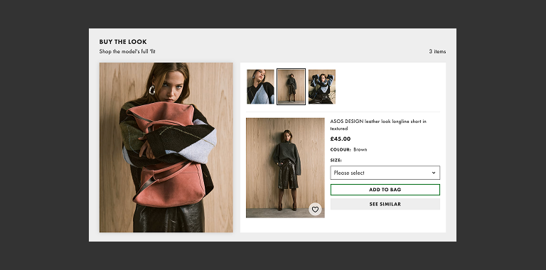
Upsell with “Shop the look”
This is a powerful upselling tactic that boosts average order value by showcasing selected product recommendations directly alongside what customers are already browsing. Leading retailers like ASOS, H&M, and New Look use this approach to highlight complementary pieces to match within a similar style or collection, creating a seamless shopping journey that feels tailored and inspiring. Not only does it encourage customers to add more to their cart, but it also saves them the hassle of manually searching for matching items, delivering both convenience and a more enjoyable shopping experience, all while driving stronger conversions for e-commerce brands.
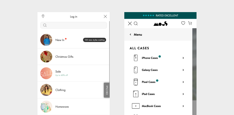
Navigational Notification Tags
Using design patterns that mirror familiar mobile platform norms, such as those found in social media or mobile designs, helps create a sense of recognition and ease for users. For instance, adding notification-style indicators to specific elements on your website can naturally draw attention to them. These markers work well when you want to spotlight “new in” stock or highlight limited-time sale items, signaling to users that something fresh or noteworthy is available. Brands like Oliver Bonas and Mous apply this effectively by using small dot markers, instantly communicating that products are yet to be seen. This approach leverages the universal association of notifications with new or important updates, making product highlights feel intuitive and engaging.
Product Finders
When faced with large product ranges or multiple variations, customers can easily feel overwhelmed and unsure where to begin. A filtering questionnaire solves this by guiding shoppers through simple step-by-step questions tailored to their needs, quickly narrowing down options and presenting the most relevant products. This not only streamlines decision-making but also builds confidence in purchase choices, leading to higher satisfaction and conversions. Brands like Saucony and Brooks showcase this effectively with their shoe finder tools, which match products to a customer’s lifestyle and preferences, turning a potentially confusing journey into a personalised, seamless shopping experience.

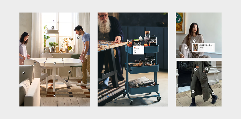
Interactive Hotspots
Hotspots let shoppers explore multiple products within a single image or scene, making the experience more inspiring and interactive. Instead of cluttered pages with endless product details, users can tap or hover on items for quick snapshots and jump straight to the relevant product pages. IKEA uses this effectively in showroom layouts, while Alo Yoga adds hotspots to influencer content, highlighting exactly what products are being shown through clickable tags. This results in smoother navigation, easier discovery and more opportunities to cross-sell and convert.
Search Prompts and Suggestions
Optimising website search is a powerful way to enhance navigation and inspire product discovery, rather than a simple text input. By highlighting category suggestions, trending keywords, or promotions, brands can guide shoppers to items they may not have considered while creating upsell opportunities. Pangaia uses the search to spotlight popular categories and searches. Oliver Bonas showcases ‘New In’ products with promotional imagery whilst Gymshark takes a clean approach with simple trending search buttons. Including these extra search features turns intent-driven shoppers into engaged browsers.

Conclusion
From smarter navigation and immersive content to personalised product finders and interactive features, these trends all strive to make e-commerce more intuitive, engaging, and rewarding for the customer. By implementing tools that simplify decision-making, highlight discovery opportunities, and build confidence in purchase choices, brands can not only create a better user experience but also see measurable gains in conversions and loyalty. In a competitive digital marketplace, adopting features like these isn’t just about keeping up, it’s about setting the standard for what a truly seamless shopping experience should feel like.
Ready to elevate your online experience? Explore our UX design services or get in touch with our team today.


