
Project
Designing a Gallery That Sells
Andy Ingham
Experience Design Director
23/4/2026
On most product pages, the image gallery is the most engaged-with area of the page, often receiving nearly 60% of all user interactions before a customer even begins to scroll. It is, by a significant margin, the most valuable real estate on any e-commerce product page. High-quality, varied product photography absolutely has its place and remains a cornerstone of any strong product page. But a growing trend, one that is showing consistently improved performance across add-to-basket and conversion metrics, is using that gallery space to its maximum effect. Rather than filling it with packshots and lifestyle imagery alone, the brands gaining an edge are those treating every frame as an active selling opportunity.

The Opportunity
The gallery is not just a viewer, it is your first and most reliable salesperson. Supported by research from the Baymard Institute, they consistently point to the same finding that shoppers engage heavily with the image gallery before they scroll. Despite this, many brands still rely on basic product photography, missing a significant opportunity to build brand credibility, highlight differentiators, reduce reliance on long-form copy further down the page, and improve add-to-basket rates.
Reviewing Homefire & Coals2U product pages, the gap was clear. Strong products, clear category authority, and genuine differentiators were present throughout both ranges, but none of those messages were appearing where shoppers were actually looking. Browsing behaviour is inherently lazy; shoppers scan, swipe, and make quick judgements before committing to reading further down the page. All the right product information was there, but positioned where fewer eyes would reach it. We identified an immediate opportunity to bring that content forward and put it directly in front of shoppers at the point of highest attention.

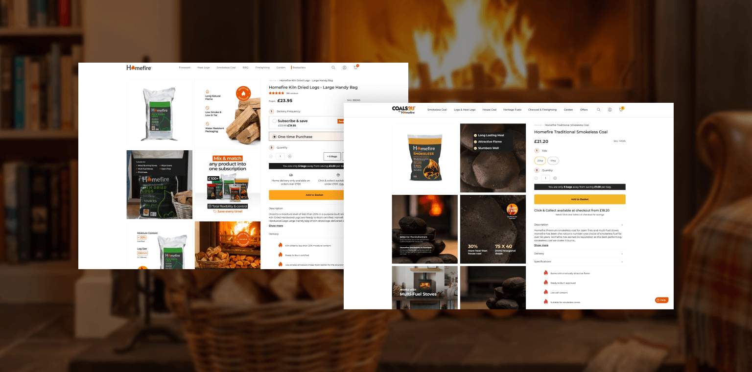
Working closely with Homefire and Coals2U, we developed a suite of branded gallery images to be deployed across both product catalogues. Each image was designed with a specific purpose: not simply to display the product, but to communicate a selling point, address a likely shopper question, or reinforce trust at the critical pre-scroll moment.
The gallery framework we built around included:
- USP Callouts
Highlighting key product attributes such as easy ignition, low smoke, and 100% natural credentials, using branded iconography and concise copy directly within the image.
- Variant and Bundle Clarity
For multi-pack products like the Kindling & Firelighters Fire Starter Multi-pack, dedicated frames break down exactly what is included, removing purchase hesitation at a glance.
- Social Proof Integration
Verified review quotes and star ratings embedded into gallery frames, surfacing trust signals in the most visible part of the page.
- Cross-sell and subscription messaging
Frames introducing Homefire's mix-and-match subscription model mid-gallery, reaching shoppers before they have committed to a decision.
- Use Case and Compatibility
Clear visual communication of where and how products can be used, covering indoor stoves, open fires, barbeques, and chimneys, reducing support queries and increasing shopper confidence.
Each frame was produced to the respective brand standards of Homefire and Coals2U, with consistent typography, colour palette, and tone of voice, ensuring the gallery felt cohesive and intentional rather than an afterthought bolted on to the product page.
The shift from passive photography to active gallery content changes the dynamic of the product page in several meaningful ways.
For Homefire and Coals2U, the galleries now do work that previously required a shopper to scroll past the fold and read through product descriptions, work that many visitors simply never did. Key differentiators are visible within the first swipe. Subscription value is communicated before the add-to-basket button is reached. Trust is established through social proof before doubt has time to form.
For the shopper, the experience becomes demonstrably easier. Rather than mentally assembling a picture of the product from disconnected copy, imagery, and spec tables, the gallery tells a coherent story. What is in the pack, why it is the right choice, what real customers think, and how it fits their life; all within a format they are already engaging with.
Reduced reliance on long-form copy is one of the most underrated outcomes of this approach. When the gallery shoulders more of the selling burden, the product description can become leaner and more scannable, which itself improves conversion for shoppers who do scroll.
Beyond conversion, the branded gallery approach strengthens overall brand credibility. Consistency and design intentionality signal professionalism. On a category where trust and safety are implicit purchase considerations, that credibility carries real commercial weight.

The work across Homefire and Coals2U is a strong example of how thoughtful, brand-led content in the right place on a product page can drive meaningful commercial results without requiring a full site overhaul. A well-built gallery does not just show a product; it sells it.
If you want to explore what improvements like these could do for your product catalogue, we would love to hear from you. Get in touch with the team to find out how we can help you turn your product pages into higher-performing selling experiences.


.jpg)